When you woke up this morning, how did you feel? When you opened your eyes and looked around, what did you see? Did you resist the urge to leave the warmth of your bed? Or were you rearing to go, energised by your surroundings to tackle the day head-on?
Your bedroom should be your sanctuary and inspiration: that one place that’s truly yours and reflects your inner thoughts and desires. A room with its own energy that spurs you on, no matter how you’re feeling, meets every need without you having to think about it, and brings a smile to your face whenever you look around.
But how do you give your bedroom personality without it becoming cluttered? Go for a minimalistic look without it feeling like a blank canvass?
It all comes down to you. So take some inspiration from our 6 best bedroom designs of all time and how we tweaked each detail to meet the needs of their residents.
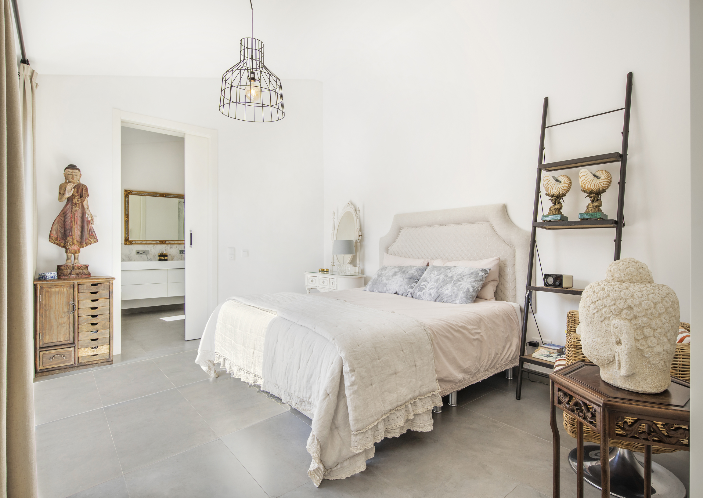
At first glance, you’d never imagine that in the not-so-distant past, this room at Casa Michel was nothing but rubble in a ruin. One that was repurposed, rebuilt and reformed from the roots up to form an airy refuge. Designed as a country home, you can certainly see the rustic edge provided by the repurposed wood, setting off its occupants’ souvenirs, each brought back from travels the world over, from Florida to Asia.
But then that’s it. Though their travels may have been widespread, the reminders have been reduced so that each one catches your eye, lets it linger, then allows you to move on. The lightness provided by white walls, an almost unnoticeable doorway into the en-suite and light-coloured, reflective flooring allows for an effortless flow of energy, whether to start the day off with a smile or put the hustle and bustle of a busy day behind you.
Then there’s the high-performance glass on the window, which allows light to spill into the room while keeping the space at just the right temperature. Used alongside insulation panels to the walls and roofs, new roof tilting, automated shading and pergolas to the south, everything works in unison to gain this home an energy efficiency rating of A.
Lilly Room
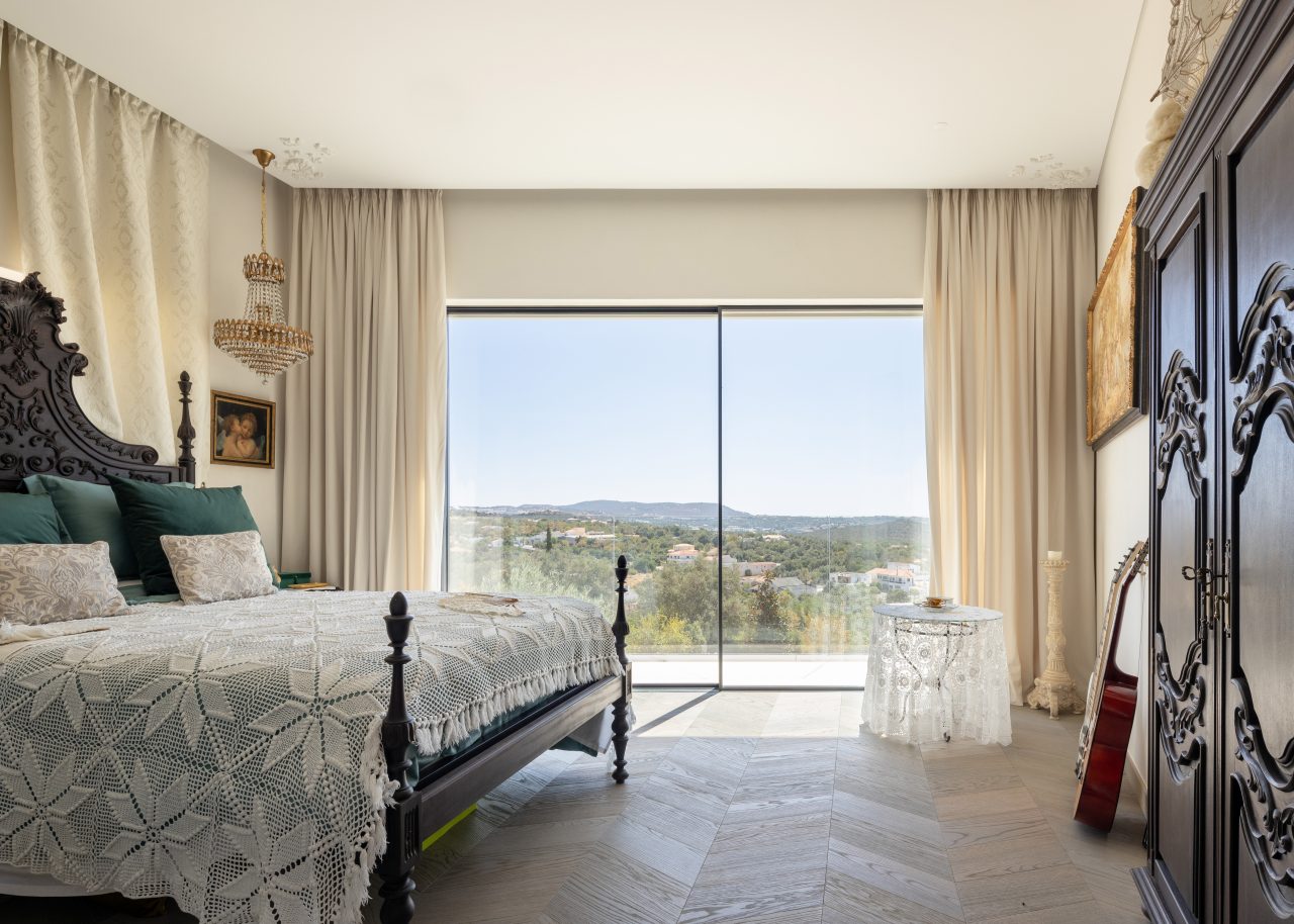
From minimalistic with Asian touches to traditional Portuguese with a twist of modernity, it’s clear why the Lilly Room in Casa Azul doesn’t need much furniture. After all – just take a look at that view. Reigning over the countryside as it rolls into the distance, this grand bed would make anyone feel like the king or queen of the world, looking out over their kingdom, traditional heavy wooden furniture brightened by plenty of natural light and a vintage off-centre chandelier.
The perfect example of how a new home can still hold memories of times long gone, and how intricately carved furniture can work in a modern setting without making it feel heavy or outdated.
Master Suite
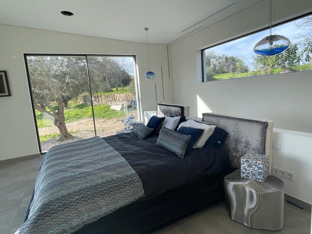
Apart from the Lilly Room, which is a world of its own, the rest of the décor in “Villa Blue” takes lighter, earthier tones and offsets them with darker shades, choosing statement pieces and allowing them to catch your eye and hold your gaze. This is the kind of décor you can’t possibly take in with a single glance because the closer you look, the more interest there is, and nothing is quite as it seems. Complementary shapes offset each other, and you realise this is a space, not a room, divided by angles rather than walls or doors. What seemed like minimalism is actually space and light brought in from the outdoors with interior patterns beautifully overlaid with mottled shadows of trees.
Imagine waking up in this bed, stretching, then propping yourself up to greet the world laid out in front of you through French windows with a view over the hills. You can see it all from here, your privacy protected by carefully positioned partitions and no more, and no less than a centuries-old olive grove. To your right is a window into the trees, making you feel like nature has crept into your room, or you’ve snuck out to find yourself in the midst of it, while behind you, a skylight lets light in from yet another angle.
This room was made to be experienced rather than looked at.
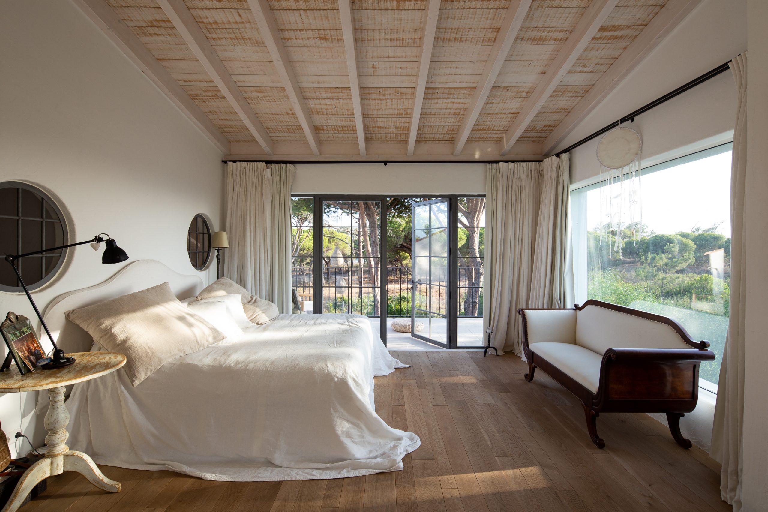
Villa AH’s interior design by white&kaki plays off the architecture, adding floaty materials and boho-inspired shapes to this beach house filled with light. Located only a stone’s throw away from the seaside, this house was built to be robust. To withstand the strong forces of the coastal weather it’s exposed to, but also so that it can be enjoyed, and the décor follows suit. You won’t find dainty pieces in this bedroom – just the essentials for maximum comfort, with the distressed wooden bedside table echoing the ceiling and the darker wood of the curtain rail repeated on the delicately carved sofa.
Through décor that is simultaneously detailed, light and effortless, leisurely energy is created thanks to the lack of straight lines and sharp angles, making you feel like you’re always on holiday. Like you don’t have a care in the world, can throw open the shutters and let the sun warm your face as you greet the day.
Master Suite
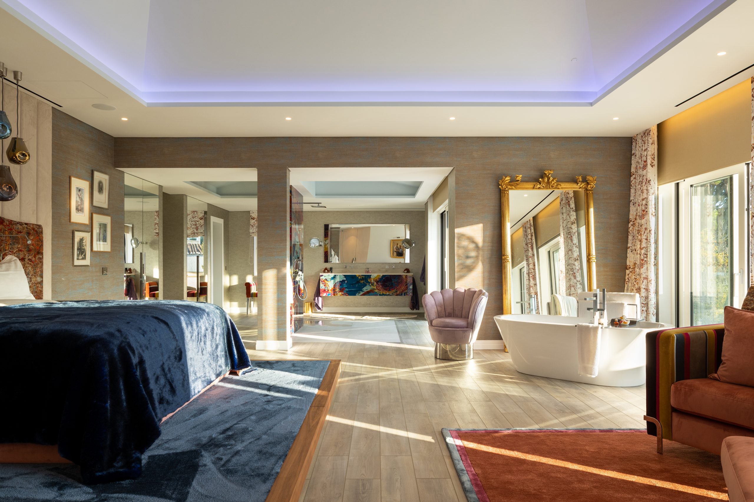
A pop-art masterpiece, Casa DA’s décor ranges from theatrical to grand, exuding luxury with rich coloured fabrics and gold leaf. However, what you may not imagine when you take in this décor produced in partnership with Eco-Lar is that it’s all sustainably sourced, even sourced locally where possible. Busy, for sure, but not overcrowded, the carefully planned architecture adds space wherever possible, from the ceiling to open archways instead of doorways, large windows and a mirror placed to reflect the light coming in from outdoors.
Then there’s the colour palette, with heavy materials in luxurious colours placed at angles creating separate spaces within the room while leaving the space open so that it doesn’t feel too big or busy.
This house’s feel is all created in the angles and lighting, but it’s the colours that make it truly pop with energy, the residents’ playfulness and zest for life reflected back at them with every turn.
Guest bedroom
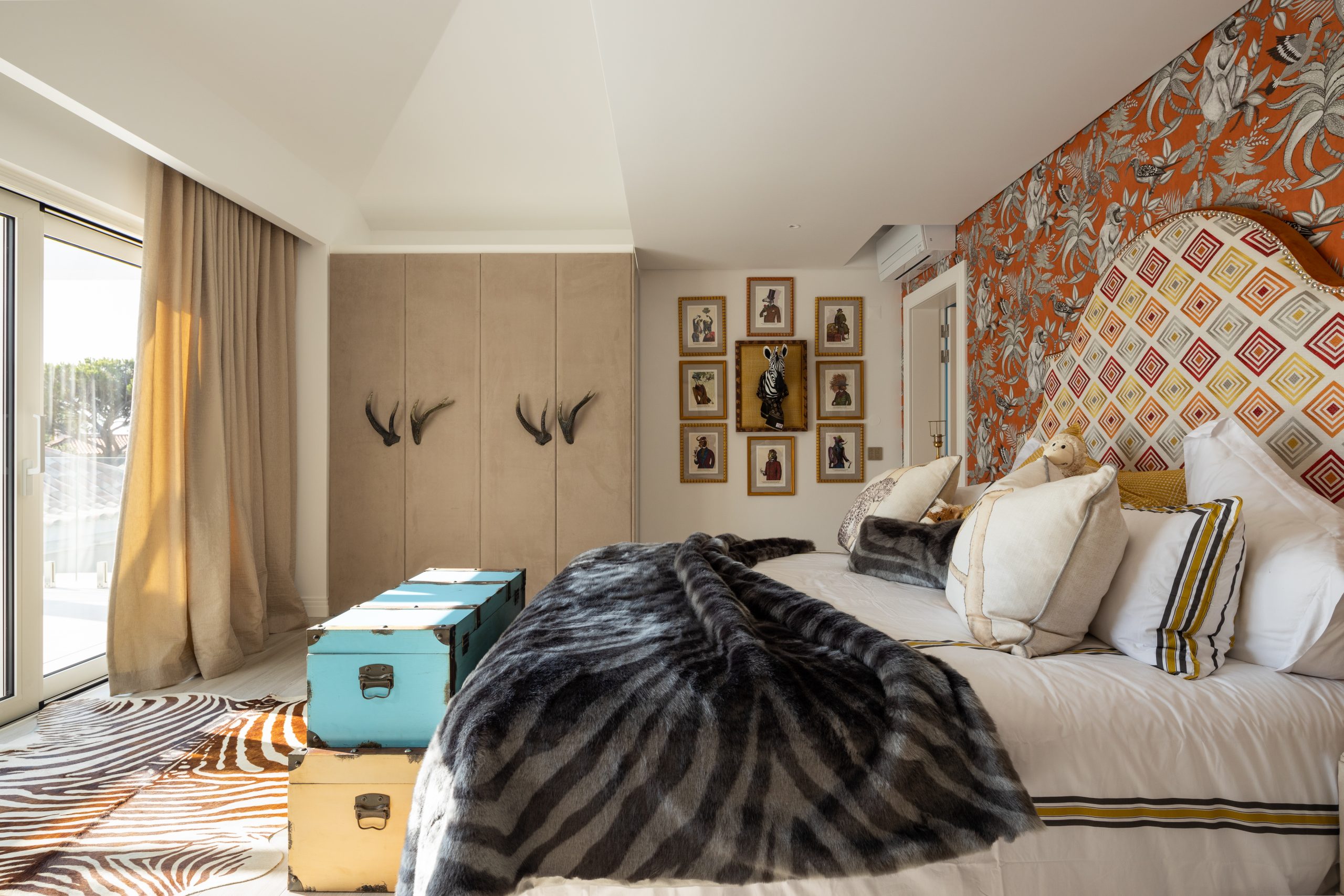
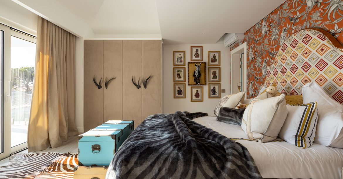
Last but certainly not least, Casa DA’s wildlife inspired guest bedroom, which is the perfect example of eccentricity while maintaining class and, most importantly, not overdoing it. Taking the pop-art characteristic of repetition from the wallpaper to the headboard, patterns clash but work, underpinned by the soft beige tones that bring the room together, making it feel homely while still exotic through a range of textures.
It may not seem it, but light, let in through wall-length sliding doors, is actually what gives this room its character, with a carefully crafted ceiling sectioning off the slightly darker bed area while allowing for the rest of the room to be bathed in direct sunlight.
5 bedrooms, each designed to empower and energise, excite and effervesce, reflecting individual styles but all filled with light, connected to nature and decorated sustainably. Now, which of these is closest to your style, and have you picked up some tips to craft the perfect bedroom for your needs and tastes?


